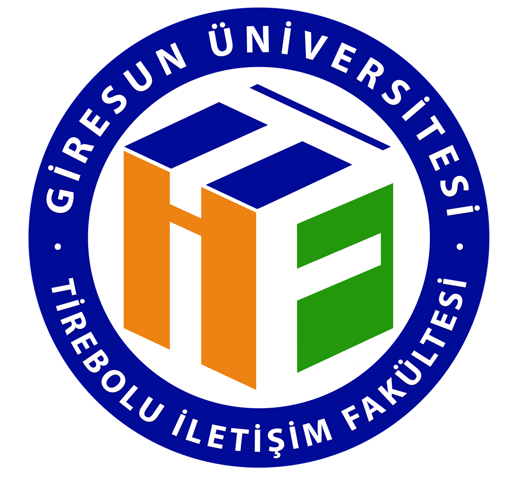
The corporate identity of the Tirebolu Faculty of Communication is built on an original visual approach that shows its ties to Giresun University, its academic integrity, and its innovative vision in the field of communication.
The cubic geometric structure at the heart of the faculty logo stands for the systematic production of knowledge, the bringing together of different disciplines, and the multidimensional nature of academic development. The interlocking geometric surfaces represent the unity of education, research, and practice. They also point to the interaction between different areas of communication and to interdisciplinary collaboration.
The color scheme, inspired by the corporate logo of Giresun University, makes visible the faculty's strong institutional bond with its parent university and the academic values they share. Together, blue, orange, and green form a shared identity language that symbolizes institutional continuity, dynamism, and growth.
The logo's geometric arrangement is a metaphor for academic knowledge rising on solid foundations and for the constantly changing nature of communication. This visual identity represents the Tirebolu Faculty of Communication's practice-oriented approach to education. That approach is guided by the principles of academic ethics, equality, sustainability, and social responsibility. It combines technological progress with human values and puts critical thinking and creative production first.
 Tirebolu Faculty of Communication